Paparoa Environmental
Branding | Logo | Print Collateral
The branding for Paparoa Environmental expresses local expertise, environmental integrity, and a strong connection to place.
The colour palette, inspired by the earthy tones of the Paparoa Ranges, evokes resilience and reliability, qualities essential in the rugged West Coast environment.
Bold yet grounded typography conveys strength and capability, while the clean layout and consistent use of colour ensure clarity and trustworthiness in every touchpoint.
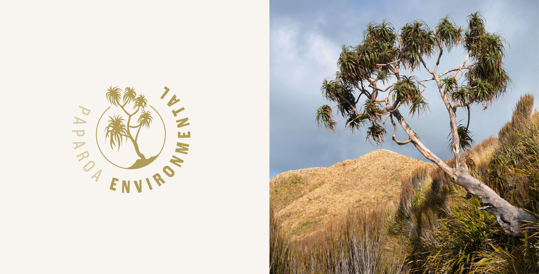
The logo features a hand-drawn Dracophyllum (Mike’s pick) a distinctive native species found throughout the Coast’s backcountry. Its inclusion reflects Paparoa Environmental’s deep ecological knowledge, local roots, and respect for the natural environment. The circular form suggests continuity and care which are core values of the business.
Altogether, the brand feels practical and trustworthy, much like the team behind it.
Key words:
Local — Practical — Trustworthy — Experienced — Connected — Natural